Page 1 of 3
Help me make a business logo!
Posted: Tue Jan 11, 2011 9:14
by GR-8
Ok people I need help. I do what I can when I can with photoshop. I'm no artistic genius. I can't make super dooper awesome things at will. It takes me time to come up with something usable. That something usable comes in about 20-60 minutes but not after looking at a screen for hrs/days. Sometimes stopping a project then coming back to it helps.
Here is what I'm doing doing. Making a logo for my Brothers new restaurant we are opening in March. It needs to look good in color and equally well in black and white. Kinda like I did for the Club Logo in my sig and the
New Club Stickers. I'm not asking for any of you to actually make a logo, but rather suggest ideas on what would look good. Something clean that says I want to have Breakfast/Lunch there. This place is a "greasy spoon" so think Denny's, Village Inn, ect but WAY BETTER FOOD AND PRICES. If any of you know Swift's or Pete's Kitchen food and atmosphere is just like that.
The old logo is/was a little cartoony and not so serious. We are gonna be here for a long time so I want it to be memorable, awesome, and plain "Lets go to Hits the Spot.
Name of the new place is "Hits the Spot Diner"

Tell me what you think when you read/hear the name of the place. What would you think/expect a logo to be?
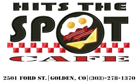
Old logo Don't mind the address or number or anything. We are not there. Some richy rich snob bought the business. Everything is more "high end" and costs more. Less on the menu to. not the "high end".
Posted: Wed Jan 12, 2011 9:14
by GR-8
18 views and no one can help?
Posted: Wed Jan 12, 2011 9:14
by geo2maz
i've got something cooking...
Posted: Wed Jan 12, 2011 9:14
by RX-7 Chris
I'm really not sure.
Posted: Wed Jan 12, 2011 9:14
by Number2
Try playing around with something that isn't a full rectangle with the letters stretched. It's ok to have some white space. 'Cafe' could be something warm to read and 'coffee-like' if that makes sense. 'hits the' could even be tilted at an angle and placed as if it were on a sign. Just suggestions for you to play around with.
Posted: Wed Jan 12, 2011 9:14
by Huzer
Number2 wrote:Try playing around with something that isn't a full rectangle with the letters stretched. It's ok to have some white space. 'Cafe' could be something warm to read and 'coffee-like' if that makes sense. 'hits the' could even be tilted at an angle and placed as if it were on a sign. Just suggestions for you to play around with.
Until you mentioned it, I didn't even SEE "Cafe" in the old logo.
Posted: Wed Jan 12, 2011 9:14
by GR-8
Huzer wrote:Until you mentioned it, I didn't even SEE "Cafe" in the old logo.
Ah yes but Cafe is not in the new logo. Diner is.
Posted: Wed Jan 12, 2011 9:14
by GR-8
Number2 wrote:Try playing around with something that isn't a full rectangle with the letters stretched. It's ok to have some white space. 'Cafe' could be something warm to read and 'coffee-like' if that makes sense. 'hits the' could even be tilted at an angle and placed as if it were on a sign. Just suggestions for you to play around with.
What? No Rectangles?

'Cafe' will not be in there. Replaced with 'Diner'.
Will keep the tips in mind.
Posted: Wed Jan 12, 2011 9:14
by GR-8
geo2maz wrote:i've got something cooking...
Lol...something cooking.
Is that all ur art work on ur site. (obviously its ur site). Can I steal some of it for wallpaper they are awesome.
Posted: Wed Jan 12, 2011 9:14
by geo2maz
GR-8 wrote:Lol...something cooking.
Is that all ur art work on ur site. (obviously its ur site). Can I steal some of it for wallpaper they are awesome.
I should have a concept to show you tonight... just trying to catch up all my work first,
Sure help yourself to anything on that site... I haven't had a chance to update it in years, been working tooooooooooooo much

Posted: Wed Jan 12, 2011 9:14
by Colombia28
My roommates are great at this stuff. I'll see if they have some time to design something. Normally while drunk as they tend to be far better drunk.... seriously.
Posted: Wed Jan 12, 2011 9:14
by Learjet45
I'm no good at stuff like this, but I have a few friends who are. I'm gonna see if they can do anything with it.
[shameless plug]
My dad works at The Restaurant Source (local business). They sell restaurant supplies. I don't know what you might still need or anything, but give em a shout if you guys need anything.
http://www.restaurantsource.com/landing.aspx
Their showroom is on Washington a couple blocks north of I-70 (near the I-70 and I-25 interchange).
[/shameless plug]
Posted: Wed Jan 12, 2011 9:14
by tsx_guy
why not rename the place to "G-Spot" . sorry Jimmy, i've got nothing.
Posted: Wed Jan 12, 2011 9:14
by Learjet45
Here a site with some pretty good logos that a friend linked me to. Something might inspire you. You never know
") http://www.logomoose.com/
http://www.logomoose.com/
Posted: Wed Jan 12, 2011 9:14
by Armur
I've been in Restaurants for 8 years now and logos were something I was pretty partial to. Not to say I designed them, but I really paid attention to them.
On thing is, in the current one you have posted, I didn't even notice there was a word at the bottom. I thought it was just part of the red decoration. I do however enjoy Red in the Logo. If you look around, a TON of logos for restaurants have red in the logo... why is this? Its because red makes people hungry, while blue makes people feel full. I know that sounds weird, but trust me, it does make a difference.
Lastly, Go with something that isn't too detailed. The logo doesn't even have to say 'diner'. Like Chipotle Mexican Grill. Their Logo only says Chipotle. Hits the Spot would be cool just by itself without the diner or cafe or anything else. The less there is, the more people can read when driving by.
Just my .02